Eventually we'll get to the meat and potatoes of this blog, which I imagine to be largely art process breakdowns and the like, but right now, I want you to come on a 15 year journey with me, one that walks the same path as the website that I genuinely think I have just finished — the journey ... of the logo.
You'd think it would be easy, for a guy who's made thousands of dollars in his life designing logos for other people, right? You haven't heard Hicks' Law:
Increasing the number of choices will increase the decision time logarithmically.
Now, normally this design principle is applied to user experience, as in, "if you have a thousand things on your page, there's more time for a customer to bail than if there were three" — but in this case, it's more of a case of my own paralysis: "If I know all these design principles, and cool Illustrator tricks, how can I possibly pick just one to represent me online?"
And then there was the question of it being "on brand"/looking good on my website, the fact that it had look timeless, to follow all the "rules" of logo design, not be too this, too that ... so I didn't. For years.
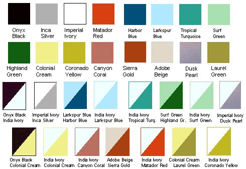
Not to say there weren't ... "attempts." Unfortunately, many of them have been lost to time, but one that survived was from the iteration of this website that I over-planned instead of actually making when I graduated college in 2013. See, I had found this Chevrolet color swatch book from 1957, and I basically let it do all the driving. I had this idea that I would use that as my foundation, have this sexy 1950's "post-war-pre-space-age-mid-century-corporate-art" thing ...
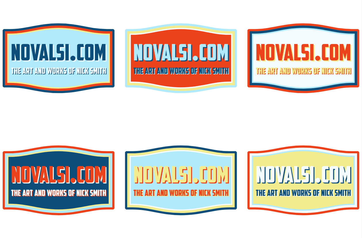
The foundational problem I've always had with regard to a portfolio website is a color scheme. If I pick any one, or two, or three, it's going to look better with some pieces than others, and it drove me mad, to the point where my solution was ... well, all the colors. Too many, as it were.
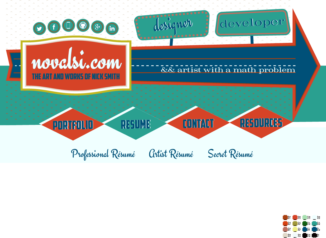
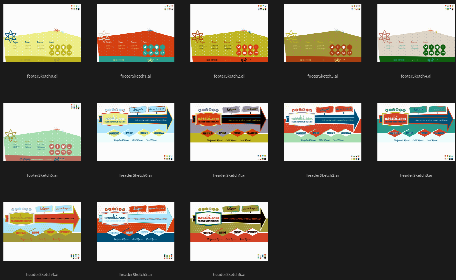
I couldn't decide! But something that started to gnaw at me was the "badge-y-ness" of the logo. It just didn't seem timeless enough to be a logo. You can already see that I was messing around with the font choices, trying to make it look more friendly, or at least "less aggressive." I made this lantern-pumpkin-wordmark thing that I really liked:
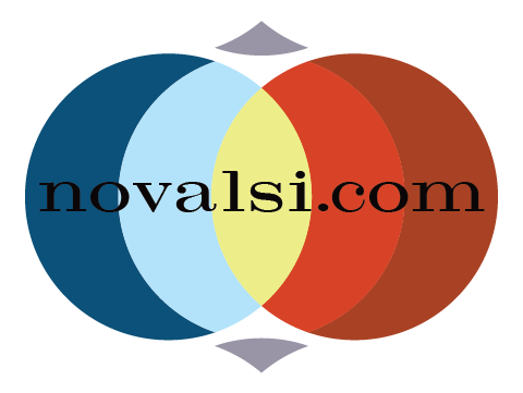
But no matter what I made, I kept finding myself drawn to the 6-pointed "atom" element I'd put down in the footer. (Note: In Illustrator, this was drawn to have sharp points at the ends, but the way my current SVG program interprets it, it doesn't. It's honestly a bit more modern-looking IMO but that's not why I'm including it as such, it's because Adobe sucks and will never get another dime from me.)

Honestly, I maybe could have stopped there. There's something really clean about the design, and I still love it. But I just wasn't ... "Nick Smith" enough. Plus, it was directly stolen from the logo of the nuclear power school I'd attended in the Navy so, clearly it needed to change. So I went to work with a hexagon, tried putting my initials in it, and immediately I started getting somewhere.
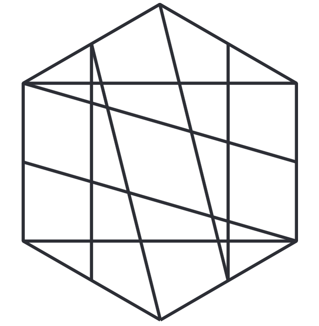
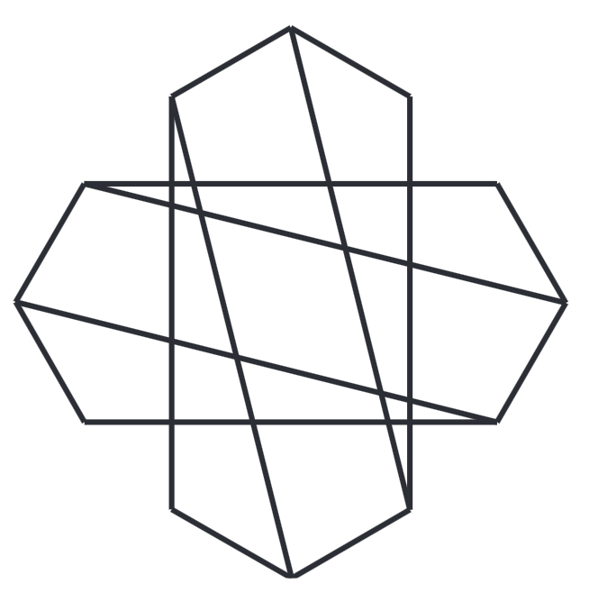
What I was kind of aiming for was a place somewhere between a knot, and that "Cool S" from middle school. The only problem was — and I remember writing this in a sketchbook around 2005 — it's really hard to enact four-way rotational symmetry in a design without it looking like ... one of those.


Obviously, not what I was going for. Even off-kilter, it just didn't work ... but I was getting closer and closer. In all of them, you can almost see an "N" and an "S" if you squint (while I explain to you that it's supposed to look like an "N" and an "S").


But I kept at it, and eventually I started to circle what I was after. It just needed a little rounding on the edges to make it less "extreme" ... and a little rounding in the middle to make it less "extremist."

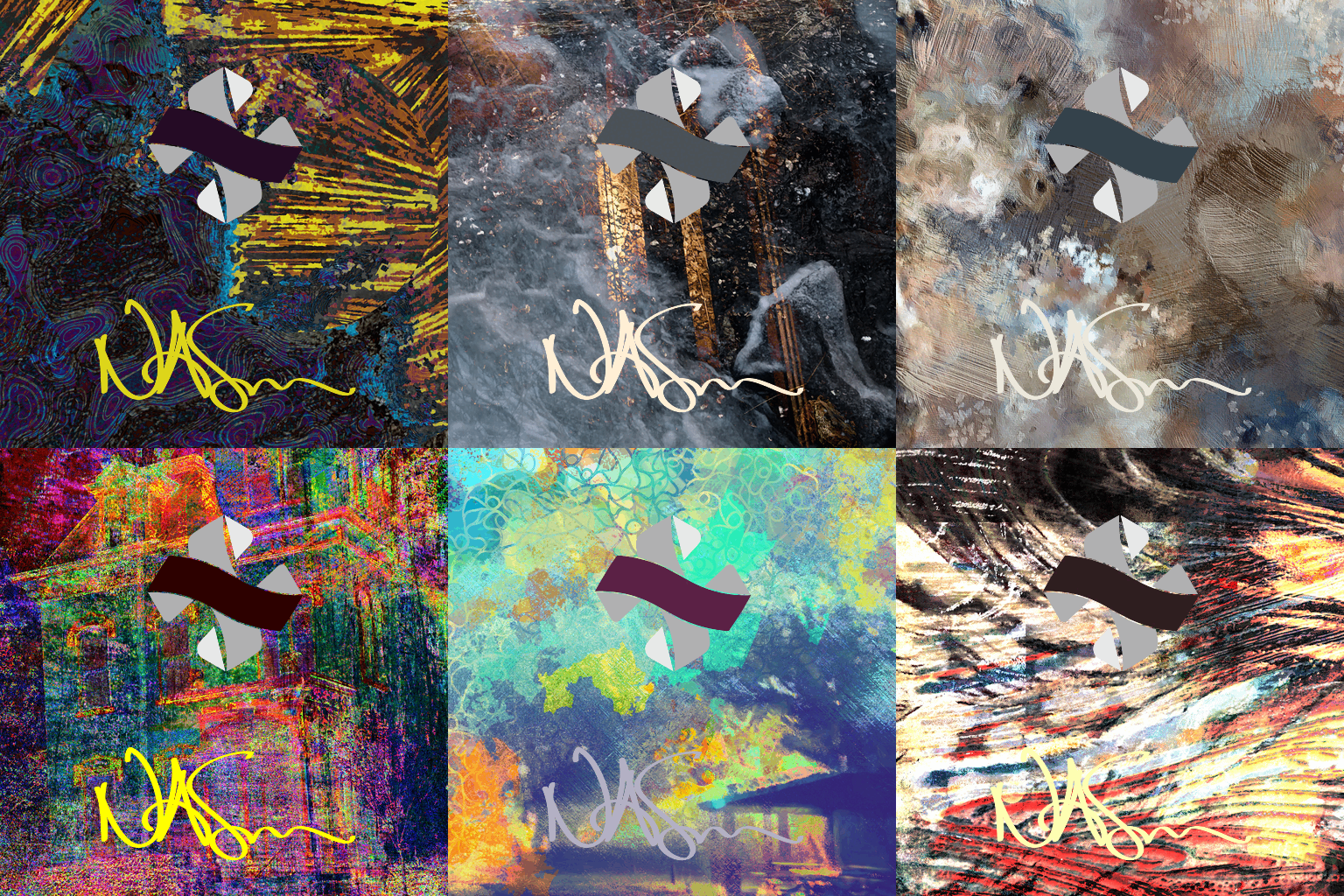
I sat on this design for 8 years before launching this website in 2026. But when I found it again, I was really impressed by its simplicity, and the way it lent itself to the thing I'd chased in my early designs, and never quite caught: the ability to change colors. This time, though, I was prepared. As a result of choosing to embrace a dark grey as my base color, I had begun to use my database to store light and dark colors for each artwork.
The signature was its own journey — it could have its own blog post, honestly, because I've been trying for years to get it to look as good as it does now. It started in 2005 when I made a font from my handwriting using a sharpie, and you could tell that I had one shot and ... kinda blew it. Then I took to practicing on an old tablet, which was, we'll say, "incredibly difficult," and took ages before I could get it right.
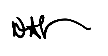
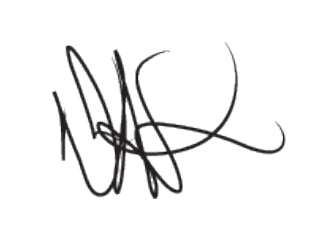

Finally, I took the two and through the wonders of the Scalable Vector Graphics (SVG) format, I was able to basically convert them into colorful math that your browser can read and show you! The future is amazing! So while you're poking around the website — especially in the store and the gallery — make sure to take note of the color changing logo at the top, and signature at the bottom ... because it took me 13 years to make. :)
As always, thank you to anyone who's read this far. Soon we'll start talking about processes and textures and the art itself, but I've just had so much time to sit and think about this website and its history that I wanted to take this opportunity to share.
See you in the next one!